A team’s uniform is more than just fabric and thread; it’s a symbol, a rallying cry, a visual representation of a city’s pride. When a new design hits the field, it’s met with cheers, jeers, and everything in between. The Washington Nationals recently unveiled their latest “City Connect” uniforms, and the reaction has been… so much worse. But beneath the surface of the online debate lies a deeper story of tradition, expectation, and the delicate balance of honoring history while forging a new identity.
Amidst the buzz of their 20th-anniversary celebrations, the Washington Nationals launched their new City Connect uniforms and dubbed The District Blueprint. This wasn’t just a press release; it was a whole event with Nationals legend Ryan Zimmerman and D.C. Mayor Muriel Bowser. The team’s previous City Connect design, the immensely popular cherry blossom-themed uniforms was officially retired, making way for this new chapter in the team’s visual history.
The District Blueprint design is part of a series of uniforms produced by Major League Baseball’s City Connect program, a partnership with Nike to develop uniforms that have a special connection to each team’s home city. The Nationals’ design is infused with D.C. iconography, with the idea behind it being more than just a uniform. Instead, it is intended to be a visual love letter to the nation’s capital. The central idea summarized in the slogan “Our Diamond. Our District,” aims to fuse the team, the city, and its unique character.
JUST IN: The Nationals have revealed their new City Connect uniforms pic.twitter.com/Xbcv8sLqSx
— MLB (@MLB) March 23, 2025
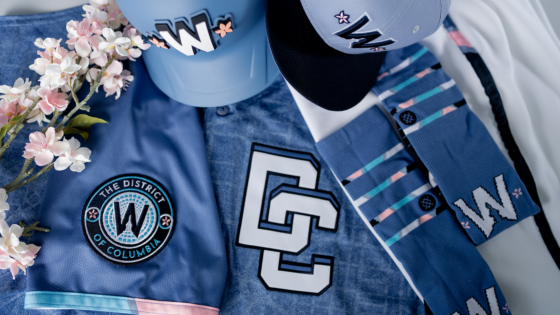
The uniform itself is a study in detail. A base in blue hues “baseball sky” and “American denim,” is overlaid with a grid in white, a direct depiction of D.C.’s famous street pattern. The chest has an interlocking “DC” logo, reminiscent of a style from the 1956 Washington Senators. A patch on the sleeve melds a stylized “W” with the Capitol Dome, with a nod to the beloved cherry blossoms. Even the white pants come with a mosaic trim, intended to represent the city’s diversity.
But here’s where the story takes a turn. Fans adored the Nationals‘ previous City Connect uniform. This prior success created a massive hurdle for any new design. The District Blueprint with its more subdued palette and intricate, almost abstract design, had a tough act to follow. And the audience was already primed for comparison, and potentially, disappointment.
Social media firestorm: Nationals fans lash out at new uniform
The initial, polite reception at the unveiling quickly gave way to a far more critical chorus online. One common theme was a direct comparison to the previous, beloved City Connect design.
As one user on the X succinctly summed up their comments, “these are so much worse than their last ones ”. And this no-nonsense inference, accompanied by the laughing emoji, neatly sums up the sentiment. The District Blueprint just could not measure up to the cherry blossom jerseys. The previous design’s distinctive color and locally relevant theme set an exceptionally high bar. And many felt the new uniform failed to do so.
A separate sticking point focused on specific design elements, particularly the prominent “DC” logo, which is a reference to the 1956 Washington Senators. Though meant to be a nod to Washington baseball history, not all fans thought so. One user on X offered this zinger: “The ‘DC’ is awful. The hat has a W in a completely different style and the DC speaks to nothing else, is just a big ugly patch. I still miss the cherry blossoms.” This comment noted that the “DC” logo felt disconnected from the rest of the uniform and not cohesive.
The criticism was not limited to the Nationals’ specific design. There were undercurrents of broader dissatisfaction toward the entire City Connect program. Another X user took that a step further to add a cynical spin: “City connects are horrible. Maybe 1 or 2 cool ones. Proves people will piss away money on anything.” Other comments have shared the same sentiment, calling the jersey “horrid,” and “this is horrible.” This comment underscores a growing frustration among some fans that the City Connect project has often led to uninspired designs that seem more like a cash grab than genuine tributes.
This isn’t an isolated opinion. The Chicago Cubs‘ “Wrigleyville” jerseys were criticized for lacking creativity and resembling the Seattle Mariners’ uniforms. The Los Angeles Dodgers’ 2024 City Connect design, with blue and red dots, was pilloried as looking like “sprinkled donuts.” And the St. Louis Cardinals’ “The Lou” jerseys, were described as “lazy,” essentially being their regular red jerseys with a minor text change.
These examples, originating across MLB, demonstrate a pattern of perceived design failures throughout the program. What do you think about the Nationals’ City Connect jersey? Let us know your thoughts in the comments below.
The post “So Much Worse” – Nationals Face Fierce Backlash as Fans Reject Latest Uniform Reveal appeared first on EssentiallySports.