A team’s energy and character – that’s what a jersey does. Nike’s City Connect program aims for unique baseball jersey designs around the league. Sometimes they turn out to be an ideal match, sometimes the experiment seems to completely misfire with the fanbase. For the Colorado Rockies, fans were eagerly waiting for an announcement after the retirement of their much-loved first design. But the reactions might not be as expected…
Colorado’s old green jersey really resonated with the Mile High fans in 2022. It drew positive reviews all over baseball circles for its clever Colorado license-plate theme. But, with MLB’s strict three-year cycle, that popular look unfortunately had to go. Anticipations were definitely built for what would replace the fan-favorite green jersey. Then, on April 12, the official MLB account broke the news straight up: “JUST IN: The Rockies have revealed their new City Connect uniforms.”
Finally, the new design was revealed.
JUST IN: The Rockies have revealed their new City Connect uniforms pic.twitter.com/MSOsxhvLhV
— MLB (@MLB) April 12, 2025
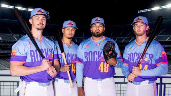
This new jersey is a much more jarring visual curveball than its nature-themed predecessor. The shirt features a pull-over design not seen in the City Connect series before. The bottom half is a vibrant purple color that contrasts very sharply with light blue in the top section. The jersey is also laced with an eye-popping neckline, with bright orange, yellow, and blue accents. There is even a subtle ripstop pattern on the fabric itself, possibly a homage to outdoor gear.
Well, team officials have explained this dramatically different direction. They referred to Colorado sunsets and skyline views from Coors Field as inspiration. Jim Kellogg, Rockies VP, deemed the new color palette “bold and it’s fun.” He also appeared to be prepared for the expected debate, acknowledging, “Not everyone is going to like this.” And infielder Ryan McMahon cautiously offered his support: “I like it, man… It’s a little louder.”
Yeah, the team clearly wanted to make a splash. But the fans?
MLB City Connect fatigue: Rockies jersey fuels fan debate
Despite the official justification focusing on sunsets and fun, many fans feel something entirely different. The team’s hope for a “bold” new hit seemed to clash immediately with strong reactions.
Fans rejected the look of the jersey the moment it came out — many felt it was too far from baseball uniformity. “Terrible…Why do the uniform designers think that a softball uniform looks good? This is MLB.” MLB uniforms have long been known as symbols of the game’s dignity, with their clean, recognizable lines representing the sport’s tradition. They are often deeply connected with the history and very roots of the teams. Think of Yankees Pinstripes, Dodgers’ Home Whites, Cardinals’ bird perched Home uniforms! So, the fan’s softball comparison likely stems from a sense that the jersey’s casual or unconventional style falls short of that legacy.
Some criticized the design for lacking a home-state connection, particularly in relation to the previous look. “What does this have to do with Colorado?” asked one confused fan. Their skepticism may come from the old beloved jersey being so closely tied to Colorado license plates. This new sunset theme was initially somewhat vague or generic, without the obvious local tie-in that fans appreciated last time.
On top of criticism of its relevance, the jersey’s color scheme also attracted pointed comments from fans who deemed it impractical for everyday wear. “Perfect for Easter, terrible for every other week,” one fan quipped. For them, it feels like this can be worn for 7 weeks or so, but for almost a year? Probably not! Also, Easter is associated with pastel colors like soft pinks or yellows, hinting that the jersey’s palette feels too delicate or gimmicky for baseball – a gritty sport!
Several fans were frustrated not only with this specific jersey but the overall trend of City Connect programs. “Can we just end the City Connects? They keep getting worse.” The City Connect series has previously had mixed success historically. Designs like the Boston Marathon-inspired jerseys have been lauded. While others like the San Francisco Giants, Washington Nationals, and now, the Colorado Rockies have most recently faced criticism for missing the mark.
Finally, some fans connected their disappointment in the jersey directly to the priorities the team has set on the field. “Let’s work on winning not how we look.” This sentiment is substantiated by the Rockies’ recent standings: The team has consistently finished near the bottom of the National League West, failing to qualify for the playoffs since 2018.
Do you have anything to add to these reactions? Or, do you like the way it looks? Care to join the conversation?
The post “Terrible” – Another MLB Jersey Fails to Impress as $1.475B Team Faces Massive Fan Backlash appeared first on EssentiallySports.


